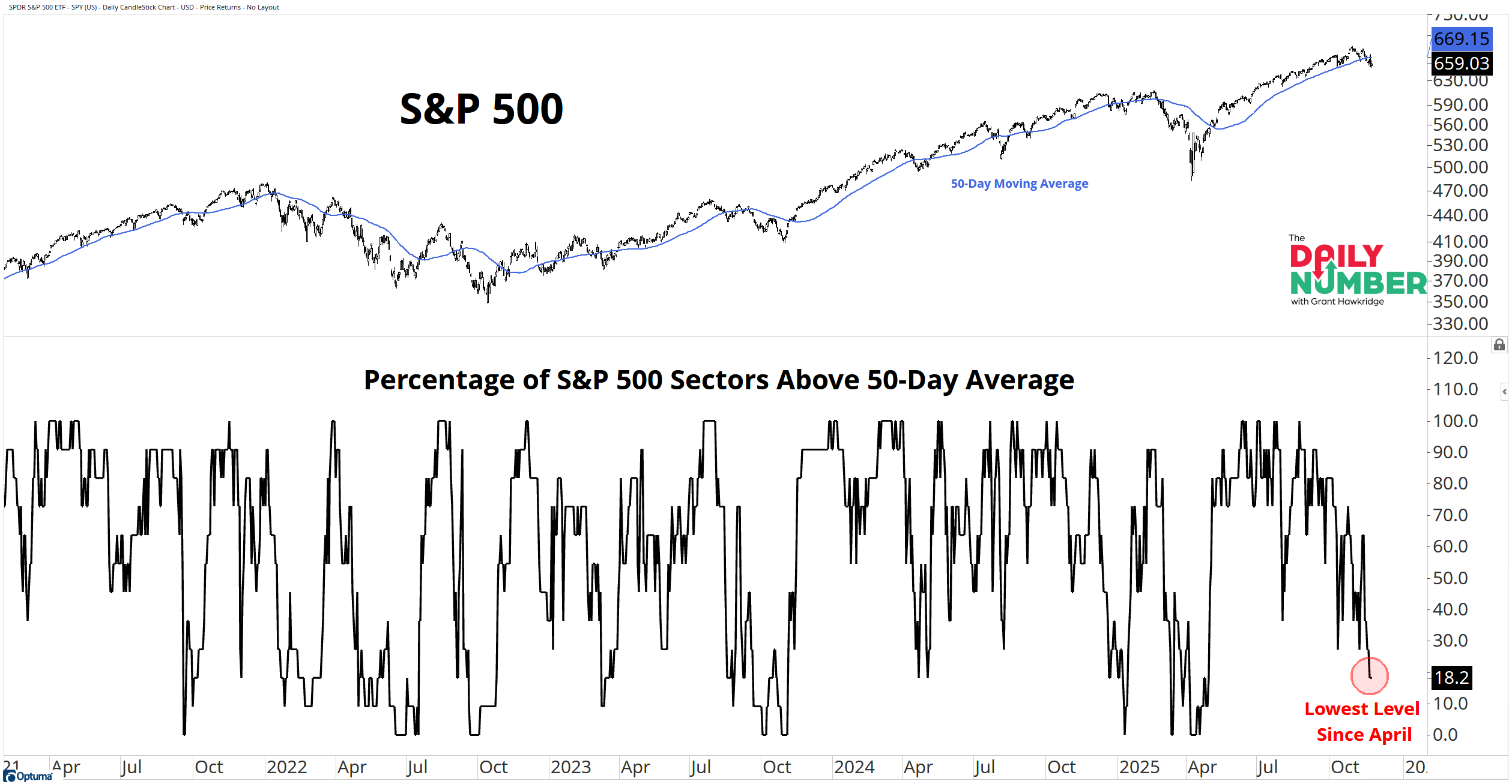
Only Two Sectors Still Holding Up 😬 By Grant Hawkridge November 24, 2025 Today's number is... 18.2%Only 18.2% of S&P 500 sectors sit above their 50-day moving average, the weakest reading since April.Here’s the chart: Let's break down what the chart shows: The top panel displays the S&P 500 in black with a blue 50-day moving average.The lower panel displays a black line that tracks the percentage of S&P 500 sectors above their 50-day moving average.The Takeaway: Only 2 of 11 sectors are still above their 50-day moving average.Healthcare and Energy are the last ones standing. Everything else has broken trend.The S&P 500 is over 4% off its high and now trades below its own 50-day average.Price and participation are both under pressure.Last week’s 2% drop came as sector trends were already fading. Now the damage is clear. Breadth cracked first. Price is following.When breadth gets this weak, the tape shifts. Rallies struggle. Sellers press harder. Every move hits with more weight.The longer this stays down, the harder it gets for the index to bounce cleanly.Either participation picks up, or the index goes looking for stronger footing.Does this reset bring leadership back in, or is the pullback just getting started?Let me know! Grant Hawkridge | Chief Aussie Operator, All Star ChartsNeed a full trading toolkit that actually helps you make moves?All Star Charts Premium gives you daily trade ideas, proprietary scans, and access to our entire analyst team.If you're serious about leveling up your strategy.Start Here!If you find my content valuable, I would greatly appreciate it if you could share it with your friends, family, and colleagues. Your help in spreading the word is invaluable in supporting our work. Thank you to all of you who share!Sign Up Free For The Daily Number The Daily Number One number. One chart. One insight moving markets today. More from The Daily Number Grant Hawkridge The Breadth Tailwind Just Flipped 🌬️ July 24, 2026 Grant Hawkridge Bonds Are Starting to Matter Again 💸 July 23, 2026 Grant Hawkridge Oil Is Sending a Very Clear Message 🛢️ July 22, 2026 Get the Number That MattersGrant’s Daily Number cuts through the noise to spotlight the single most important data point moving markets right now. You must have JavaScript enabled to use this form. Email Address