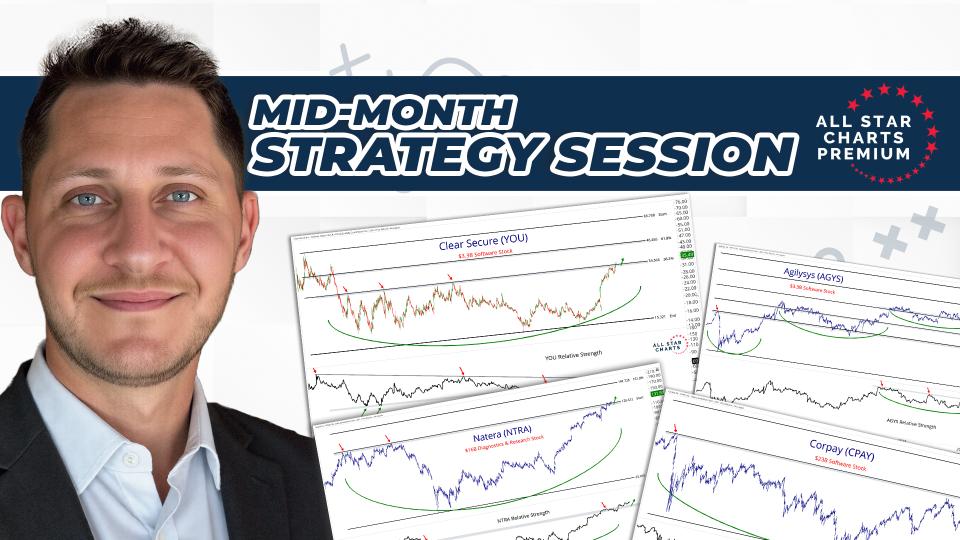
Welcome to our latest RPP Report, where we publish return tables for a variety of different asset classes and categories along with commentary on each.
Looking at the past helps put the future into context. In this post, we review the absolute and relative trends at play and preview some of the things we’re watching to profit in the weeks and months ahead.
You can consider this our weekly state of the union address as we break down and reiterate both our tactical and structural outlook on various asset classes as well as discuss the most important themes and developments taking place in markets all around the world.
While the weight of the evidence remains in the bull's favor, we continue to see more data arrive that suggests the environment could be shifting toward one that is less conducive to risk assets, at least over shorter timeframes.
In fact, we'd argue that bears have more talking points today than they've had at any time over the trailing year. With each passing week, data continues to suggest a more cautionary approach is appropriate...
Check out this week's Momentum Report, our weekly summation of all the major indexes at a Macro, International, Sector, and Industry Group level.
By analyzing the short-term data in these reports, we get a more tactical view of the current state of markets. We can then put these near-term developments into the context of the big picture and glean insights into the structural trends at play.
Let's jump right into it with some of the major takeaways from this week's report:
* ASC Plus Members can access the Momentum Report by clicking the link at the bottom of this post.
Macro Universe:
Procyclical Commodities gave back some of their recent gains this week.
Copper was down over 2.34%. However, the primary trend remains intact with momentum in a bullish regime.
Lumber was the hardest hit this week, dropping over 7% reversing its extreme momentum reading from last week to 64 this week.
New short-term lows across the board in many US equity indexes, from the S&P to Dow Utilities, and even SMIDs...
We retired our "Five Bull Market Barometers" in mid-July to make room for a new weekly post that's focused on the three most important charts for the week ahead.
This is that post, so let's jump into this week's edition.
Over the past few days as the market continued to churn sideways, we witnessed a set of stocks doing well as a group. As sector rotation continues to play out, we see different groups play the game of musical chairs as they move in and out of strong and weak zones.
Fertilizer stocks seemed to have gotten activated recently and there a few names here that we've been tracking for some time.
Let's take a look at the individual names:
The first one here is GSFC. Gujarat State Fertilizers & Chemicals. What we see here is a three-year base breakout with the price moving past its long-term resistance of 114. As the overhead supply has been absorbed at these levels, the price is now ready to move higher in the next leg of the rally.
The indicator has been in the bullish momentum territory, staying rather close to this zone during interim corrections as well.
We are bullish above the level of 114 with a target near 167.
From the desk of Steven Strazza @Sstrazza and Ian Culley @Ianculley
Lumber futures have been on an absolute tear since last spring. The vertical but volatile price action off last year's lows is something for the history books.
After trading down to 250 in late March of 2020, Lumber has since shot back above 1,600, where it trades today. It’s no wonder social media is full of people flaunting their wealth with stacks of timber.
But we have to ask... is it time for a pullback? Is this rally overdone here?
Let’s take a deeper look and discuss why we believe the logical move for Lumber over the short term is sideways... or even lower.
Here’s the chart. Look at that face ripper - up nearly 7x in just over a year!
Lumber futures just barely sliced through our target of 1,636 last week, yet have fallen back below that level in recent sessions.
The one chart is actually two charts this week. On the left is the S&P 500 and the percentage of stocks in that index that are above their 200-day average (90%). On the right is the NASDAQ Composite and the percentage of stocks in that index that are above their 200-day average (50%). The contrast could hardly be more stark. Even as weakness has been seen in some of the largest sectors (like Technology), the S&P 500 is being supported by ongoing strength in cyclical values areas. The NASDAQ has little to no exposure to those sectors that are doing the best right now and is bearing the brunt of speculative excesses being unwound (the collapse in equity call options is evidence of this shift).
I planted most of the vegetables for the garden over the past couple of weeks. Seeds and seedlings. Neat rows and clustered groups. Into the raised beds they went.
I don't know what the day to day (or week to week) fluctuations in the weather will be. But I do know that it is (finally) Spring. Planting as the air temperature rises and our daylight hours expand increases the likelihood of a bountiful garden later this summer. Leafy greens (kale, arugula, chard) were the first into the soil. They can withstand cooler temperatures than the cucumbers, peppers and tomatoes.
As a gardener, I have some understanding of the underlying trends and conditions that guide the seasons. Plant too soon and a late frost will kill off tender seedlings. Plant too late and the summer heat will sap the strength of plants without well-developed root systems.
It's about knowing the growing environment, managing temperature risks and finding opportunities to increase vegetable production.
Some might dismiss this as a farmer’s market timing. I call it prudent.
These are the registration details for our live monthly conference call for Premium Members of All Star Charts.
This month’s Conference Call will be held on Monday May 24th at 6PM ET. As always, if you cannot make the call live, the video and slides will be archived and published here along with every other live call since 2015.
But there are still areas of the market with strong & expanding internals. Breadth data continues to be mixed just like we’re seeing from many asset classes right now.
What we do here is take a chart that’s captured our attention, and remove the x and y-axes as well as any other labels that could help identify it.
This chart can be of any security, in any asset class, on any timeframe. Sometimes it’s an absolute price chart, other times it’s on a relative basis.
It might be a ratio, a custom index, or maybe the price is inverted. It could be all three!
The point is, when we aren’t able to recognize what’s in front of us, we put aside any biases we may have and scrutinize the price behavior objectively.
While you can try to guess the chart, the point is to make a decision…
So let us know what it is… Buy, Sell, or Do Nothing?
Something we’ve been working on internally this year is using various bottoms-up tools and scans to complement our top-down approach. One way we’re doing this is by identifying stocks as they climb the market-cap ladder from small, to mid, to large, and ultimately to mega-cap status (over $200B).
Once they graduate from small-cap to mid-cap status (over $2B) they come on our radar. Likewise, when they surpass the roughly $30B mark, they roll off our list.
But the scan doesn’t just end there. We only want to look at the strongest growth industries in the market as that is typically where these potential 50-baggers come from.
Some of the best performers in recent decades – stocks like Priceline, Amazon, Netflix, and Salesforce, to a myriad of others… all would have been on this list at some point during their journey to becoming the market behemoths they are today.
When you look at the stocks in our table you will notice we...
Inflation surprise points brings new pressure on portfolios tilted toward yesterday
With bond & stock returns more likely to struggle, expand investment opportunity set
Commodity exposure poised to do well as inflation picks up and yields rise
The headlines are filled with stories of higher prices for pretty much everything (have you tried to buy a used car recently) and our charts show widespread strength in commodities (beyond just the headline grabbing moves in lumber and copper. Still, this morning’s CPI report managed to surprise many. The headline CPI was up 0.8% in April, versus an expected increase of 0.2%, and the core CPI was up 0.9% in the month, versus an expected increase of 0.3%. That was the largest monthly increase in the core CPI since 1982. The core CPI is now up 3.0% over the past year, the largest such change since 1996. While this may be due in part to various...
Three days off the highs for the S&P 500 and twitter traders are acting like the sky is falling. And maybe it is? But at times like these, I like to look for opportunities to fade what often prove to be short-lived spikes in volatility.
And the best way I know how to do this is to look at sector ETFs and observe the ones displaying the highest relative implied volatilities.