Steve Strazza 2 to 100 Club From the Desk of Steve Strazza @Sstrazza Welcome to The 2 to 100 Club. In this scan, we look to identify the strongest growth stocks as they climb the market-cap ladder from... December 17, 2025 2 to 100 Club All Star Charts Premium Members Only Search Displaying 9049 - 9072 of 20098 Sean McLaughlin [Options P2P] New Position: USO The next new position in our Paid-to-Play portfolio is: March 21, 2023 Options Paid to Play Paid To Play Members Only Sean McLaughlin [Options P2P] Trade Alert: Closed EFA Position We had a resting GTC order filled at our profit target in the Paid-to-Play portfolio today: March 21, 2023 Options Paid to Play Paid To Play Members Only JC Parets CEO Craft Reports a Large ARLP Purchase The largest insider buy on today’s list comes in a Form 4 filing by Joe Craft, president and CEO of Alliance Resource Partners $ARLP. Craft reported a purchase of roughly $2.7 million. March 21, 2023 Stocks Strazza The Hot List JC Parets Swing Trader Pro: Morning Briefing (03-21-2023) From the Desk of Kimmy Sokoloff The market is gapping up nicely into the next resistance zone. For $SPY, we have to watch this 396.50 area. If it can clear this level, there's room to 400. Otherwise it... March 21, 2023 Stocks Swing Trader Pro Newsletter JC Parets [Premium] Mid-Month Conference Call Video Recording March 2023 This is the video recording of the March 2023 Mid-month Conference Call. March 21, 2023 All Star Charts Premium Stocks Currencies Commodities Interest Rates Intermarktet Analysis Conference Call bonds Bitcoin ASC breadth seasonality Video Members Only Ian Culley [Video] Gold Rush: Demand Absorbs Supply Buyers taking control of a market heading into the weekend exude confidence. And Gold bugs have done it two weeks in a row now and counting, as they reclaimed the former 2011 highs. So what’s next for precious metals? Well, if Gold... March 20, 2023 All Star Charts Premium All Star Charts Gold Rush ASC Gold Ian Gold Rush Video Members Only Alfonso De Pablos, CMT Follow the Flow (03-20-2023) From the Desk of Steve Strazza @sstrazza and Alfonso Depablos @Alfcharts This is one of our favorite bottom-up scans: Follow the Flow. In this note, we simply create a universe of stocks that experienced the most unusual options... March 20, 2023 All Star Charts Premium Premium Stocks ASC Strazza Follow The Flow Alfonso Members Only Alfonso De Pablos, CMT Under the Hood (03-20-2023) From the desk of Steve Strazza @Sstrazza. Welcome back to Under the Hood, where we're covering all the action for the week ended March 17, 2023. This report is published bi... March 20, 2023 All Star Charts Premium Premium Stocks ASC Strazza Under The Hood Grant Members Only Ian Culley Gold Hits a Fresh 52-Week High From the Desk of Ian Culley @IanCulley Precious Metals are back on track, with Gold leading the way. Gold bugs closed out last week with another strong showing, absorbing... March 20, 2023 All Star Charts Premium All Star Charts Gold Rush ASC Gold Ian Gold Rush Members Only Patrick Dunuwila Daily Chart Report 📈 Monday, March 20th, 2023 March 20, 2023 The Chart Report Daily Chart Report Front Top Content Featured Stories JC Parets Swing Trader Pro: Afternoon Briefing (03-20-2023) From the Desk of Kimmy Sokoloff The market was very whippy today, and I believe it will be this way till after the Fed on Wednesday. We'll take it day by day... March 20, 2023 Stocks Swing Trader Pro Newsletter Ian Culley Gold Hits a Fresh 52-Week High From the Desk of Ian Culley @IanCulleyPrecious Metals are back on track, with Gold leading the way.Gold bugs closed out last week with another strong showing, absorbing overhead supply at a critical level – the former 2011 highs... March 20, 2023 ASC Gold Rush Report Patrick Dunuwila Chart of the Day - Monday, March 20th, 2023 March 20, 2023 The Chart Report Commodities Gold TCR Chart of the Day $GLD $GC_F Ian Culley Sean McLaughlin [Options P2P] Rolled GDXJ Position to May We've adjusted a position in the Paid-to-Play portfolio today: March 20, 2023 Options Paid to Play Paid To Play Members Only JC Parets New Uptrends Emerging The most impressive behavior the past few weeks has to be in Bitcoin. You can also see the performance of things like RIOT, COIN and other Bitcoin related stocks.... March 20, 2023 Bitcoin ASC ASC Chart of the Day JC Parets Top Executives Are Buying CPRI Shares The most significant insider activity on today’s list comes in a series of Form 4 filings by the CEO and CFO of Capri Holdings Limited $CPRI. The two executives combined for purchases in excess of $10 million last week. March 20, 2023 Stocks Strazza The Hot List JC Parets Swing Trader Pro: Morning Briefing (03-20-2023) From the Desk of Kimmy Sokoloff It's been a very volatile year so far, and we have the Fed this week, so expect even more chop. I really wanted $SPY to close above its 200-day moving average, but that didn't... March 20, 2023 Stocks Swing Trader Pro Newsletter JC Parets S&P500 Gains 1.4% this Week We saw a very respectable 1.4% rally in the S&P500 this week. But the index is ... March 18, 2023 Stocks Commodities ASC ASC Chart of the Day JC Parets Saturday Morning Chartoons: Rotation into Tech Continues This is the weekly post that aggregates all the charts we put together throughout the week and organizes them all into one, easy to flip through deck. March 18, 2023 All Star Charts Premium ASC Chartoons Members Only Steve Strazza Energy Is on the Ropes From the Desk of Steve Strazza @Sstrazza Due to the recent bank failures, this week has been all about the financial sector and the selling pressure taking place there. However, the price action for energy stocks has been even... March 17, 2023 All Star Charts Premium Premium Stocks Commodities ASC Strazza Commodities Weekly Members Only Alfonso De Pablos, CMT International Hall of Famers (03-17-2023) From the desk of Steve Strazza @Sstrazza and Alfonso Depablos @AlfCharts Our International Hall of Famers list is composed of the 100 largest US-listed international stocks, or ADRs. We’ve also sprinkled in some of the largest... March 17, 2023 All Star Charts Premium Premium Stocks ASC Strazza Alfonso International Hall Of Famers Members Only Patrick Dunuwila Daily Chart Report 🍀 Friday, March 17th, 2023 March 17, 2023 The Chart Report Daily Chart Report Front Top Content Featured Stories JC Parets Swing Trader Pro: Afternoon Briefing (03-17-2023) From the Desk of Kimmy Sokoloff As of midday, the market's pulling in. It's due for a rest, and we have the Fed next week. March 17, 2023 Stocks Swing Trader Pro Newsletter Steve Strazza Volatility Rocks the Bond Market From the Desk of Steve Strazza @Sstrazza Markets have been on the ropes since late last week when a Silicon Valley Bank press release sparked a run on regional banks. As Wall Street scrambles to reprice the financial sector --... March 17, 2023 All Star Charts Premium Premium bonds ASC Strazza Bond Report Members Only Pagination Back 1 … Page 374 Page 375 Page 376 Page 377 Page 378 Page 379 Page 380 Page 381 Page 382 … 838 Next Recent Episodes What Are My Options? Is YOUR Stock a Good Options Trade? Live Breakdown December 17, 2025 Hosted by Sean McLaughlin Caleb Franzen's Favorite Charts December 17, 2025 The Long And Short Of It with Kenny Glick December 16th December 16, 2025 Hosted by Kenny Glick The Open Bar Let's Put Some Money To Work December 16, 2025 Hosted by Steve Strazza Algo Trading With Michael Nauss December 16, 2025 Chart Request Live You Request It, We Break It Down. December 15, 2025 With special guest(s) Sam Gatlin Alfonso De Pablos, CMT Missed it? No problem!Replays of all our past episodes are always available in the episode archives. View Episode Archives
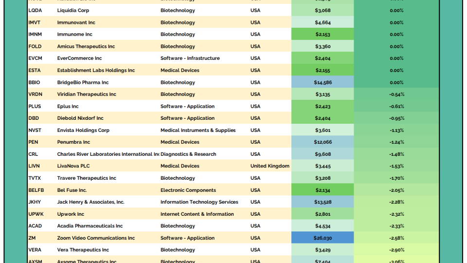
Steve Strazza 2 to 100 Club From the Desk of Steve Strazza @Sstrazza Welcome to The 2 to 100 Club. In this scan, we look to identify the strongest growth stocks as they climb the market-cap ladder from... December 17, 2025 2 to 100 Club All Star Charts Premium Members Only
Sean McLaughlin [Options P2P] New Position: USO The next new position in our Paid-to-Play portfolio is: March 21, 2023 Options Paid to Play Paid To Play Members Only
Sean McLaughlin [Options P2P] Trade Alert: Closed EFA Position We had a resting GTC order filled at our profit target in the Paid-to-Play portfolio today: March 21, 2023 Options Paid to Play Paid To Play Members Only
JC Parets CEO Craft Reports a Large ARLP Purchase The largest insider buy on today’s list comes in a Form 4 filing by Joe Craft, president and CEO of Alliance Resource Partners $ARLP. Craft reported a purchase of roughly $2.7 million. March 21, 2023 Stocks Strazza The Hot List
JC Parets Swing Trader Pro: Morning Briefing (03-21-2023) From the Desk of Kimmy Sokoloff The market is gapping up nicely into the next resistance zone. For $SPY, we have to watch this 396.50 area. If it can clear this level, there's room to 400. Otherwise it... March 21, 2023 Stocks Swing Trader Pro Newsletter
JC Parets [Premium] Mid-Month Conference Call Video Recording March 2023 This is the video recording of the March 2023 Mid-month Conference Call. March 21, 2023 All Star Charts Premium Stocks Currencies Commodities Interest Rates Intermarktet Analysis Conference Call bonds Bitcoin ASC breadth seasonality Video Members Only
Ian Culley [Video] Gold Rush: Demand Absorbs Supply Buyers taking control of a market heading into the weekend exude confidence. And Gold bugs have done it two weeks in a row now and counting, as they reclaimed the former 2011 highs. So what’s next for precious metals? Well, if Gold... March 20, 2023 All Star Charts Premium All Star Charts Gold Rush ASC Gold Ian Gold Rush Video Members Only
Alfonso De Pablos, CMT Follow the Flow (03-20-2023) From the Desk of Steve Strazza @sstrazza and Alfonso Depablos @Alfcharts This is one of our favorite bottom-up scans: Follow the Flow. In this note, we simply create a universe of stocks that experienced the most unusual options... March 20, 2023 All Star Charts Premium Premium Stocks ASC Strazza Follow The Flow Alfonso Members Only
Alfonso De Pablos, CMT Under the Hood (03-20-2023) From the desk of Steve Strazza @Sstrazza. Welcome back to Under the Hood, where we're covering all the action for the week ended March 17, 2023. This report is published bi... March 20, 2023 All Star Charts Premium Premium Stocks ASC Strazza Under The Hood Grant Members Only
Ian Culley Gold Hits a Fresh 52-Week High From the Desk of Ian Culley @IanCulley Precious Metals are back on track, with Gold leading the way. Gold bugs closed out last week with another strong showing, absorbing... March 20, 2023 All Star Charts Premium All Star Charts Gold Rush ASC Gold Ian Gold Rush Members Only
Patrick Dunuwila Daily Chart Report 📈 Monday, March 20th, 2023 March 20, 2023 The Chart Report Daily Chart Report Front Top Content Featured Stories
JC Parets Swing Trader Pro: Afternoon Briefing (03-20-2023) From the Desk of Kimmy Sokoloff The market was very whippy today, and I believe it will be this way till after the Fed on Wednesday. We'll take it day by day... March 20, 2023 Stocks Swing Trader Pro Newsletter
Ian Culley Gold Hits a Fresh 52-Week High From the Desk of Ian Culley @IanCulleyPrecious Metals are back on track, with Gold leading the way.Gold bugs closed out last week with another strong showing, absorbing overhead supply at a critical level – the former 2011 highs... March 20, 2023 ASC Gold Rush Report
Patrick Dunuwila Chart of the Day - Monday, March 20th, 2023 March 20, 2023 The Chart Report Commodities Gold TCR Chart of the Day $GLD $GC_F Ian Culley
Sean McLaughlin [Options P2P] Rolled GDXJ Position to May We've adjusted a position in the Paid-to-Play portfolio today: March 20, 2023 Options Paid to Play Paid To Play Members Only
JC Parets New Uptrends Emerging The most impressive behavior the past few weeks has to be in Bitcoin. You can also see the performance of things like RIOT, COIN and other Bitcoin related stocks.... March 20, 2023 Bitcoin ASC ASC Chart of the Day
JC Parets Top Executives Are Buying CPRI Shares The most significant insider activity on today’s list comes in a series of Form 4 filings by the CEO and CFO of Capri Holdings Limited $CPRI. The two executives combined for purchases in excess of $10 million last week. March 20, 2023 Stocks Strazza The Hot List
JC Parets Swing Trader Pro: Morning Briefing (03-20-2023) From the Desk of Kimmy Sokoloff It's been a very volatile year so far, and we have the Fed this week, so expect even more chop. I really wanted $SPY to close above its 200-day moving average, but that didn't... March 20, 2023 Stocks Swing Trader Pro Newsletter
JC Parets S&P500 Gains 1.4% this Week We saw a very respectable 1.4% rally in the S&P500 this week. But the index is ... March 18, 2023 Stocks Commodities ASC ASC Chart of the Day
JC Parets Saturday Morning Chartoons: Rotation into Tech Continues This is the weekly post that aggregates all the charts we put together throughout the week and organizes them all into one, easy to flip through deck. March 18, 2023 All Star Charts Premium ASC Chartoons Members Only
Steve Strazza Energy Is on the Ropes From the Desk of Steve Strazza @Sstrazza Due to the recent bank failures, this week has been all about the financial sector and the selling pressure taking place there. However, the price action for energy stocks has been even... March 17, 2023 All Star Charts Premium Premium Stocks Commodities ASC Strazza Commodities Weekly Members Only
Alfonso De Pablos, CMT International Hall of Famers (03-17-2023) From the desk of Steve Strazza @Sstrazza and Alfonso Depablos @AlfCharts Our International Hall of Famers list is composed of the 100 largest US-listed international stocks, or ADRs. We’ve also sprinkled in some of the largest... March 17, 2023 All Star Charts Premium Premium Stocks ASC Strazza Alfonso International Hall Of Famers Members Only
Patrick Dunuwila Daily Chart Report 🍀 Friday, March 17th, 2023 March 17, 2023 The Chart Report Daily Chart Report Front Top Content Featured Stories
JC Parets Swing Trader Pro: Afternoon Briefing (03-17-2023) From the Desk of Kimmy Sokoloff As of midday, the market's pulling in. It's due for a rest, and we have the Fed next week. March 17, 2023 Stocks Swing Trader Pro Newsletter
Steve Strazza Volatility Rocks the Bond Market From the Desk of Steve Strazza @Sstrazza Markets have been on the ropes since late last week when a Silicon Valley Bank press release sparked a run on regional banks. As Wall Street scrambles to reprice the financial sector --... March 17, 2023 All Star Charts Premium Premium bonds ASC Strazza Bond Report Members Only
What Are My Options? Is YOUR Stock a Good Options Trade? Live Breakdown December 17, 2025 Hosted by Sean McLaughlin
Chart Request Live You Request It, We Break It Down. December 15, 2025 With special guest(s) Sam Gatlin Alfonso De Pablos, CMT