Gold has been in an uptrend for the past 358 trading days, marking the 8th-longest trend since the 1970s.
Here’s the chart:
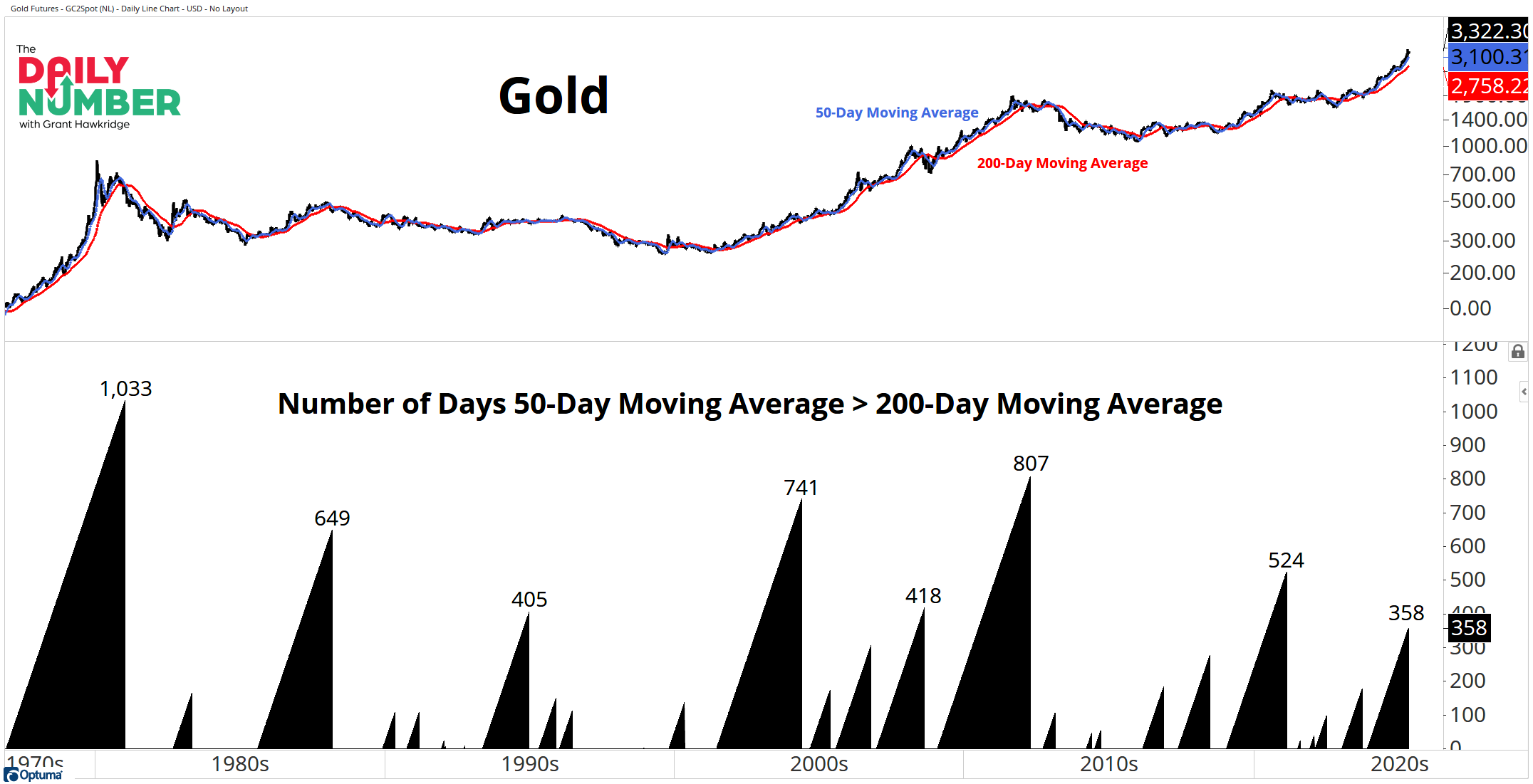
Let's break down what the chart shows:
The black line in the upper panel indicates the price of gold. The blue line represents the 50-day moving average, while the red line shows the 200-day moving average of gold.
The black bars in the bottom panel indicate days when the 50-day average is greater than the 200-day average.
The Takeaway: To clarify, I identify a strong uptrend when the 50-day moving average is above the 200-day moving average. Currently, gold is experiencing one of the longest uptrends in the past 60 years, ranking as the eighth longest overall so far. At this point, there are no signs of this trend slowing down, as it continues to move upward and to the right on the chart. Therefore, it's difficult to be pessimistic about gold at this time.
However, Right now the 50-day moving average is 12.4% above the 200-day moving average. The last time the trend was extended this significantly was in September 2021, just as gold was peaking, then we saw a three-year consolidation period.
So, are we on the brink of a potential shift in gold's trajectory? Or will this trend continue to gain momentum and push even higher?
Grant Hawkridge | Chief Aussie Operator, All Star Charts
PS: Join Steve on Thursday at 1pm ET. He will be going through a few of his recent winners and how he knew to get bullish a few weeks ago. Click here and don't miss out!
If you find my content valuable, I would greatly appreciate it if you could share it with your friends, family, and colleagues. Your help in spreading the word is invaluable in supporting our work. Thank you to all of you who share!