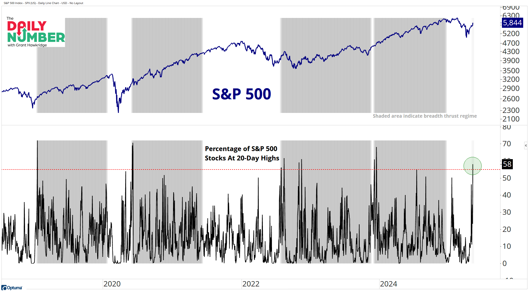
58% of S&P 500 stocks made 20-day new highs yesterday.
Here’s the chart:
Let's break down what the chart shows:
The blue line in the top panel is the S&P 500 index price.
The black line in the bottom panel shows the percentage of S&P 500 stocks at 20-day highs.
The red line in the bottom panel is the trigger for a breadth thrust.
The gray shading highlights when in a breadth thrust regime.
The Takeaway: Market participation is heating up!
Yesterday, my favorite breadth thrust officially fired.
The breadth thrust I am talking about is when 55% or more of the S&P 500 stocks reach a 20-day new high.
Yesterday, we saw 58% of S&P 500 stocks making 20-day new highs,
This means we have entered a breadth thrust regime that lasts one year.
It’s not an all-clear signal or a guarantee that the market will go up, but this breadth thrust regime points to healthy market leadership conditions and indicates that the stock market may more easily move up and to the right.
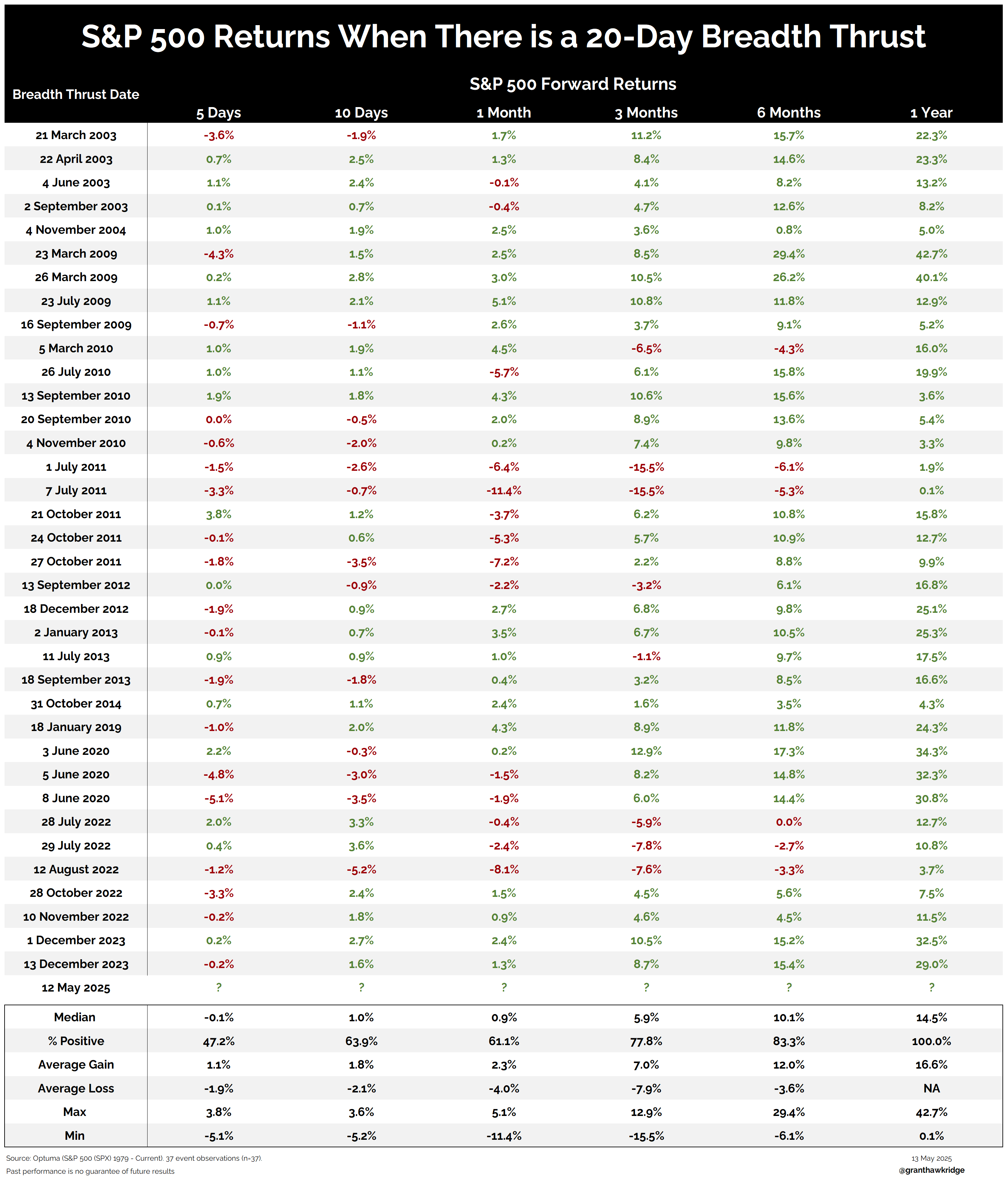
The past performance of this breadth thrust is impressive.
See the table above for the stats!
100% of the time, a year later, the markets are on average up over 15%.
Grant Hawkridge | Chief Aussie Operator, All Star Charts
ICYMI: While most traders froze during the rotation, Steve got aggressive — and it paid off fast. He just shared every detail of his approach and the new trade ideas setting up right now. Watch the replay and get the next one.
If you find my content valuable, I would greatly appreciate it if you could share it with your friends, family, and colleagues. Your help in spreading the word is invaluable in supporting our work. Thank you to all of you who share!