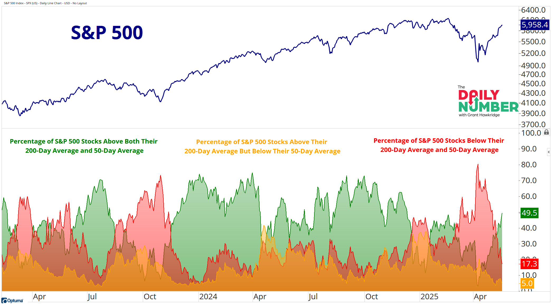
49.5% of S&P 500 stocks are now in strong uptrends.
Here’s the chart:
Let's break down what the chart shows:
The blue line in the top panel shows the price of the S&P 500 index.
In green is the % of S&P 500 stocks above both their 200-day and their 50-day moving averages, indicating a longer-term uptrend.
In yellow is the % of S&P 500 stocks above their 200-day but below their 50-day moving averages. This indicates a longer-term uptrend but a short-term mess.
In red is the % of S&P 500 stocks below their 200-day and below their 50-day moving averages, indicating a longer-term downtrend.
The Takeaway: This chart does a good job of showing what’s really happening under the surface. And something just changed.
For 47 trading days, more S&P 500 stocks were trading below both their 200-day and 50-day moving averages. That trend had been in place for a while.
Now, that’s flipped.
Nearly half of the S&P 500 stocks are now above both their 200-day and 50-day averages. That means more stocks have moved into uptrends. We haven’t seen this many names trending higher since December of last year.
Does this shift mean we’re in a new environment? Maybe. Maybe not. I don’t know.
But that’s the point. Markets change. And when they do, it helps to notice and adjust. Sticking to one view too tightly can be a problem.
So, right now, the weight of evidence is leaning more bullish. That doesn’t mean the market moves straight up—but it does suggest things are getting better.
Grant Hawkridge | Chief Aussie Operator, All Star Charts
Need a full trading toolkit that actually helps you make moves? All Star Charts Premium gives you daily trade ideas, proprietary scans, and access to our entire analyst team. If you're serious about leveling up your strategy,start here.
If you find my content valuable, I would greatly appreciate it if you could share it with your friends, family, and colleagues. Your help in spreading the word is invaluable in supporting our work. Thank you to all of you who share!