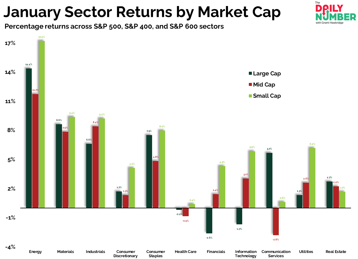
The first month of the year is now finished, and small caps did most of the work.
Here’s the chart:
Let's break down what the chart shows:
The chart displays grouped vertical bars by sector.
Each sector has three bars:
Dark green bars represent Large Cap returns.
Red bars represent Mid Cap returns.
Light green bars represent Small Cap returns.
The Takeaway: January finished with small caps leading in 9 of 11 sectors.
That is the first full month read of the year. Leadership did not sit with the largest stocks. It showed up across the market in smaller names.
Energy made that clear. Large caps gained 14.4%. Mid caps gained 11.7%. Small caps gained 17.2%. Returns increased as size declined. The strongest performance came from the most volatile end of the sector.
That same pattern showed up beneath the surface in other sectors. Large-cap Financials and Technology finished January lower. Mid and small caps in both sectors closed higher. Money did not leave these groups. It stayed involved and just shifted lower down the cap scale.
Technology highlighted the split the best. Large-cap Tech fell 1.7%. Mid caps gained 3.1%. Small caps gained 5.9%. The weakness was concentrated in the biggest names, not the group as a whole.
At the same time, defensive sectors never really took control in January. Staples, Utilities, and Health Care stayed in the background. Money did not rotate toward protection. It remained allocated to higher-risk names.
That is how the year opened. Risk was rewarded, with smaller caps leading.
So, are you positioned for what is actually leading this market?
If you find my content valuable, I would greatly appreciate it if you could share it with your friends, family, and colleagues. Your help in spreading the word is invaluable in supporting our work. Thank you to all of you who share!