The owner of Vans, Columbia and Timberland (among other things) came in better than expected despite yet another decline in the Vans division, which fell by 14%. There's a...
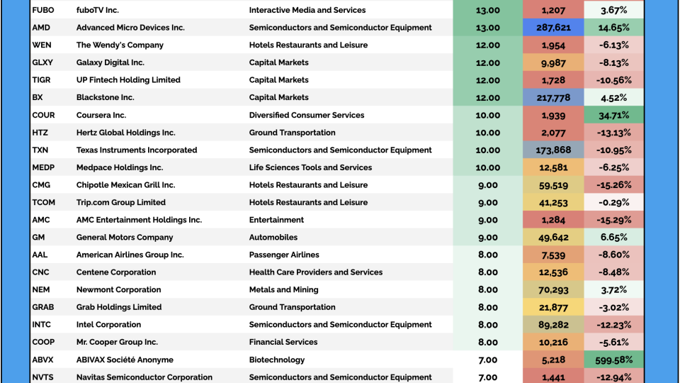
Every day, we sift through the filings to spot where the real conviction lies – cutting through the noise to highlight the most meaningful insider moves.
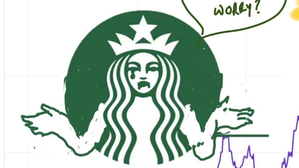
The company missed on EPS, posted a 6th straight quarter of negative comps and still has little to show for 12 months of work CEO Brian Niccol has put in since he was plucked away from Chipotle for a cool...
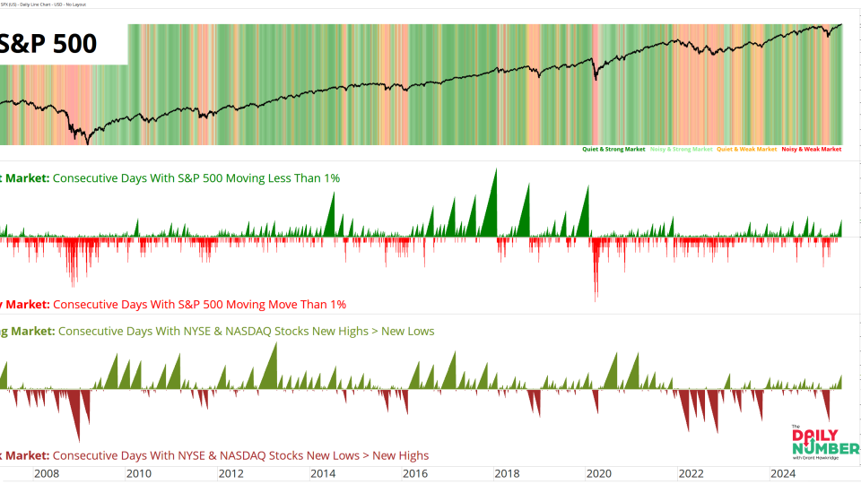
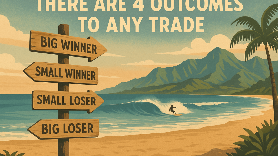
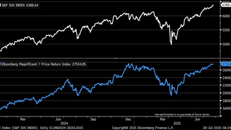
There’s really no other way to say it. While the S&P 500 and Nasdaq have continued to print fresh all-time highs, day after day, my open positions have been quietly—and not so...
Every day, we sift through the filings to spot where the real conviction lies – cutting through the noise to highlight the most meaningful insider moves.
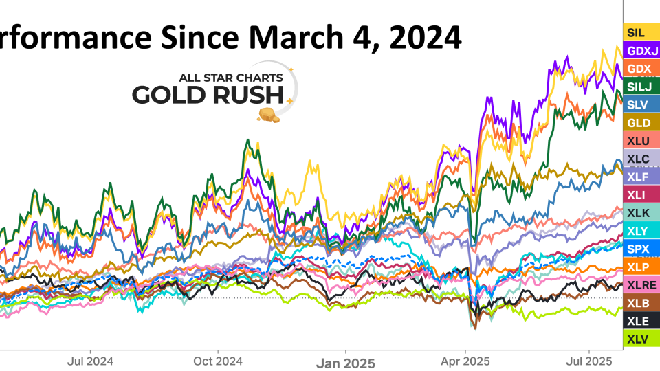
We’ve been pounding the table all year on international stocks, making the case that we’re in the early stages of a major outperformance cycle outside the U.S.It’s been one of the dominant investment themes...