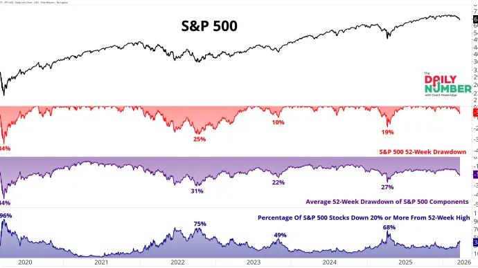
Grant Hawkridge More Than One Third of the Market Is in a Bear Market 📉 Today's number is... 38.4%38.4% of S&P 500 stocks are down 20% or more from their 52-week highs.Here’s the chart: Let's break down what the chart shows:... March 24, 2026 The Daily Number Grant
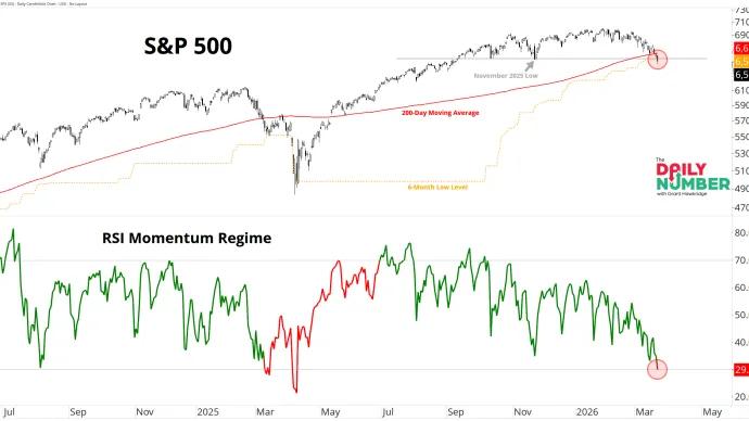
Grant Hawkridge RSI Breaks 30, Regime Turns Bearish 📉 Today's number is... 29.9The S&P 500’s 14-day RSI just dropped below 30 and now sits at 29.9, flipping the RSI Momentum Regime to bearish.Here’s the chart: Let's break down what the chart... March 23, 2026 The Daily Number Grant
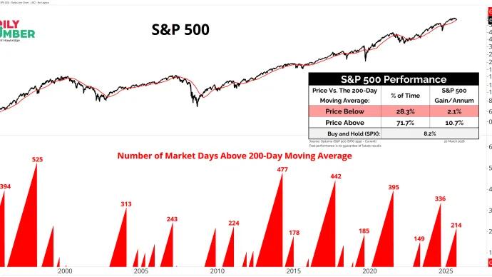
Grant Hawkridge The Streak Just Snapped 📉 Today's number is... 214The S&P 500 just ended a 214-day streak above its 200-day moving average.Here’s the chart: Let's break down what the chart shows:... March 20, 2026 The Daily Number Grant
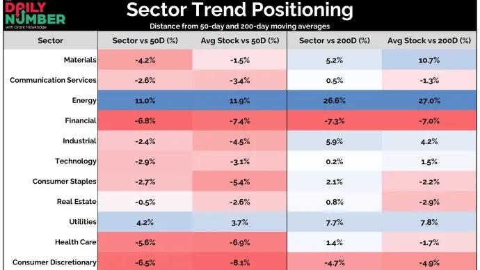
Grant Hawkridge Most Sectors Are Below Trend 📉 Today's number is... 99 of 11 S&P 500 sectors are trading below their 50-day moving average.Here’s the table: Let's break down what the table shows:... March 19, 2026 The Daily Number Grant
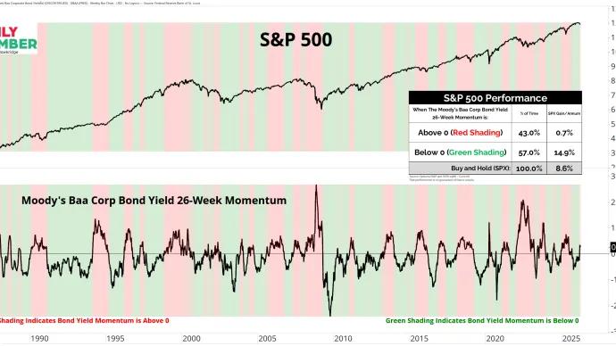
Grant Hawkridge Rates Flip Against You 📉 Today's number is... 0.26Moody’s Baa corporate bond yield 26-week momentum is at 0.26, back above zero.Here’s the chart: Let's break down what the chart shows:... March 18, 2026 The Daily Number Grant
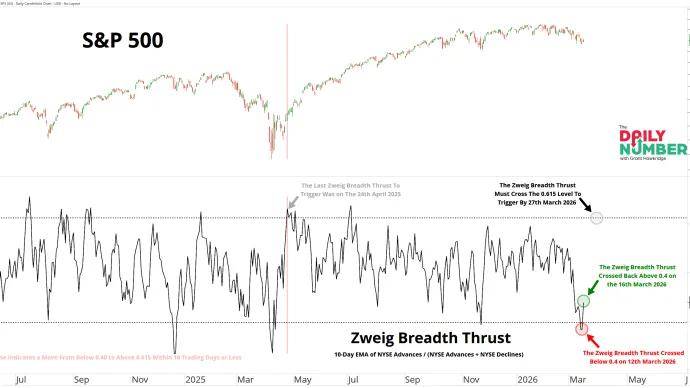
Grant Hawkridge 9 Days Left to Prove It ⏱️ Today's number is... 9The Zweig Breadth Thrust has 9 trading days left to move from below 0.40 to above 0.615.Here’s the chart: Let's break down what the chart shows:... March 17, 2026 The Daily Number Grant
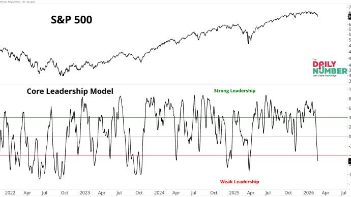
Grant Hawkridge Leadership Just Cracked 📉 Today's number is... –5.2My Core Leadership Model sits at –5.2, deep in the weak leadership zone.Here’s the chart: Let's break down what the chart shows:... March 16, 2026 The Daily Number Grant
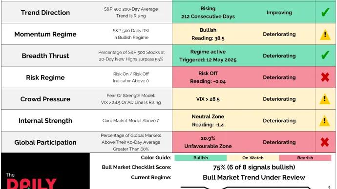
Grant Hawkridge Bull Market Checklist Loses Two Signals ⚠️ Today's number is... 6Six of the eight signals in the Bull Market Checklist remain positive, but two have now flipped bearish as risk appetite and global participation deteriorate during the latest market price action... March 9, 2026 The Daily Number Grant
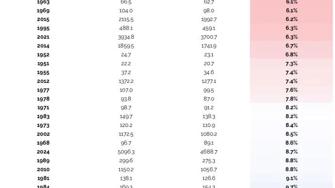
Grant Hawkridge The Quietest Start Since 1950 🔇 Today's number is... 2.7%The S&P 500 has moved just 2.7% between its highest and lowest closing prices during January and February this year.Here’s the table: Let's break down what the... March 5, 2026 The Daily Number Grant
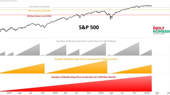
Grant Hawkridge Market Still Waiting for Its First Real Dip 📉 Today's number is... 68The S&P 500 has gone 68 trading days without a 5% pullback.Here’s the chart: Let's break down what the chart shows:... March 4, 2026 The Daily Number Grant
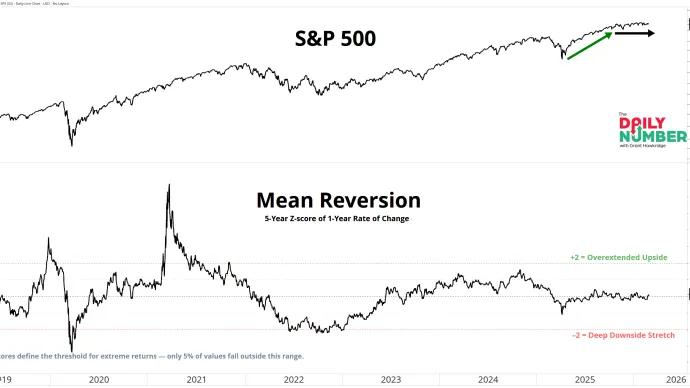
Grant Hawkridge Breathing at the Highs 🫁 Today's number is... 0.12The S&P 500’s 5-year Z-score of its 1-year rate of change sits at 0.12.Here’s the chart: Let's break down what the chart shows:... March 3, 2026 The Daily Number Grant
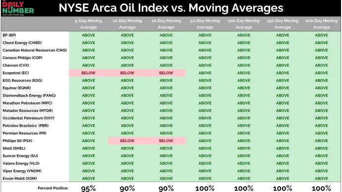
Grant Hawkridge Energy Enters Full Participation Mode 🔥 Today's number is... 100%100% of the holdings in the NYSE Arca Oil Index are trading above their 200-day moving average.Here’s the table: Let's break down what the table shows:... March 2, 2026 The Daily Number Grant
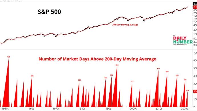
Grant Hawkridge Above the Line for 200 Days 📈 Today's number is... 200The S&P 500 has now closed 200 straight trading days above its 200-day moving average.Here’s the chart: Let's break down what the chart shows:... February 27, 2026 The Daily Number Grant
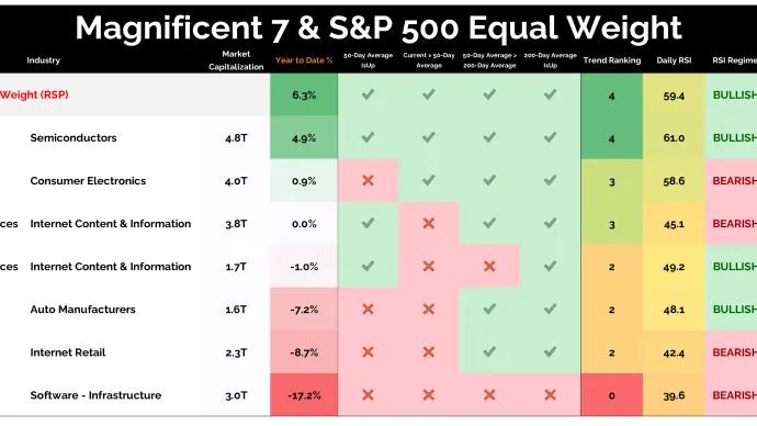
Grant Hawkridge Equal Weight Is Beating the Generals 📊 Today's number is... 6.3%The S&P 500 Equal Weight Index is up 6.3% year-to-date and is beating every single Magnificent 7 name.Here’s the table: Let's break down what the table shows:... February 26, 2026 The Daily Number Grant
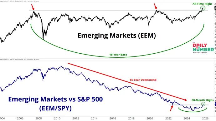
Grant Hawkridge This Range Took 18 Years to Break 🌍 Today's number is... 18Emerging Markets broke above an 18-year ceiling and are pushing to fresh all-time highs.Here’s the chart: Let's break down what the chart shows:... February 25, 2026 The Daily Number Grant
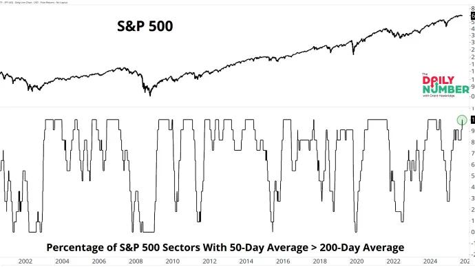
Grant Hawkridge Sector Breadth Hits 100%🔥 Today's number is... 100%100% of S&P 500 sectors have their 50-day moving average above their 200-day moving average.Here’s the chart: Let's break down what the chart shows:... February 24, 2026 The Daily Number Grant
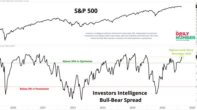
Grant Hawkridge Bulls Have the Edge 🐂 Today's number is... 44.2%The Investors Intelligence Bull–Bear spread sits at 44.2%, its highest reading since December 2024.Here’s the chart: Let's break down what the chart shows:... February 23, 2026 The Daily Number Grant
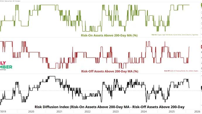
Grant Hawkridge The Bulls Still Lead. For Now. 🐂 Today's number is... +20The Risk Diffusion Index sits at +20 pts.Here’s the chart: Let's break down what the chart shows:The... February 20, 2026 The Daily Number Grant
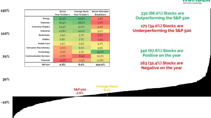
Grant Hawkridge The Index Is Hiding the Real Story 📊 Today's number is... 6.0%The average S&P 500 stock is up 6.0% Year-To-Date, while the index itself is only up 0.6%.Here’s the chart: Let's break down what the chart shows:... February 19, 2026 The Daily Number Grant
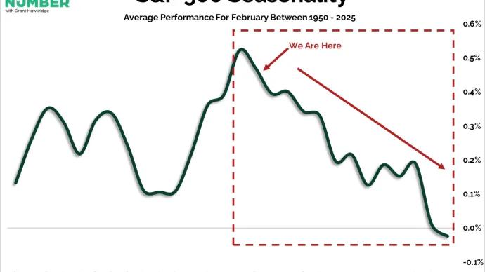
Grant Hawkridge February Peaks Mid-Month 📆 Today's number is... 15thFebruary 15th marks the historical high-water point of the month.Here’s the chart: Let's break down what the chart shows:... February 18, 2026 The Daily Number Grant
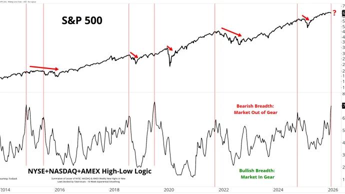
Grant Hawkridge The Market Is Out of Gear ⚠️ Today's number is... 7The NYSE + NASDAQ + AMEX High-Low Logic Index just printed above 7.Here’s the chart: Let's break down what the chart shows:The top of the chart displays a... February 17, 2026 The Daily Number Grant
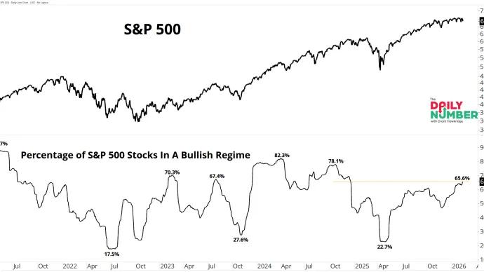
Grant Hawkridge Two-Thirds Of The Index Are In Bull Mode⚡ Today's number is... 65.6%65.6% of S&P 500 stocks are in a bullish RSI regime.Here’s the chart: Let's break down what the chart shows:The top section displays the S&P 500... February 13, 2026 The Daily Number Grant
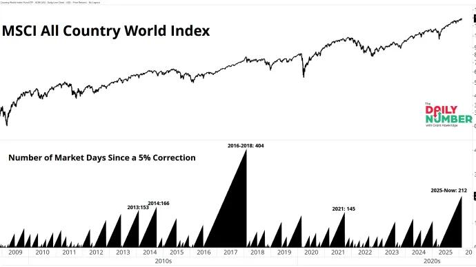
Grant Hawkridge Second Longest Run Since 2008🌍 Today's number is... 212The MSCI All Country World Index has gone 212 trading days without a 5% correction.Here’s the chart: Let's break down what the chart shows:The top section... February 12, 2026 The Daily Number Grant
Grant Hawkridge The Market Is Fine. Mega Cap Tech Isn’t. 🧩 Today's number is... 51%Only 51% of Nasdaq 100 stocks are trading above their 200-day moving average.Here’s the chart: Let's break down what the chart shows:The chart displays... February 11, 2026 The Daily Number Grant