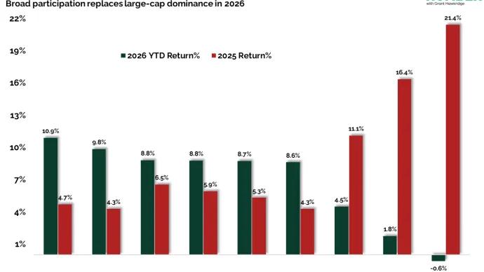
Grant Hawkridge Last Year’s Leaders Are This Year’s Laggards 🪜 Today's number is... 2Two different trading environments, and this year is not last year’s market.Here’s the chart: Let's break down what the chart shows:The chart displays bar... February 10, 2026 The Daily Number Grant
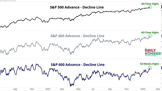
Grant Hawkridge Call It Whatever You Want. This Is a Bull Market 🐂 Today's number is... 3Three market caps advance–decline lines are advancing together, large, mid, and small.Here’s the chart: Let's break down what the chart shows:The chart... February 9, 2026 The Daily Number Grant
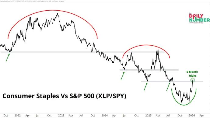
Grant Hawkridge Staples Are Back in the Conversation 🧱 Today's number is... 5Consumer Staples versus the S&P 500 just hit a 5-month high.Here’s the chart: Let's break down what the chart shows:The chart displays a single ... February 6, 2026 The Daily Number Grant
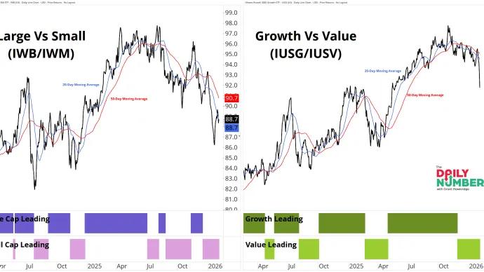
Grant Hawkridge The Market Is Spreading Out 🌱 Today's number is... 2The tactical model has two active parts, size and style, showing wide gaps with Small Caps leading by 5.2% and Value leading by 6.7% year to date.Here’s the chart: Let's... February 5, 2026 The Daily Number Grant
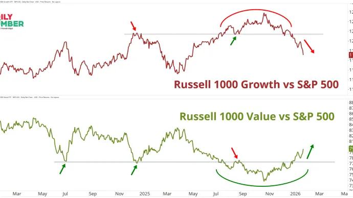
Grant Hawkridge Growth Loses It. Value Takes It. 🔁 Today's number is... 2Two factor trends are moving in opposite directions at the same time.Here’s the chart: Let's break down what the chart shows:The top panel tracks the Russell... February 4, 2026 The Daily Number Grant
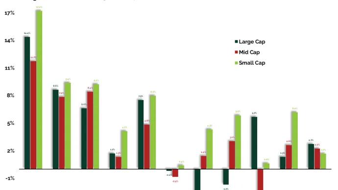
Grant Hawkridge Small Caps Did the Heavy Lifting 🧱 Today's number is... 1The first month of the year is now finished, and small caps did most of the work.Here’s the chart: Let's break down what the chart shows:The chart displays... February 3, 2026 The Daily Number Grant
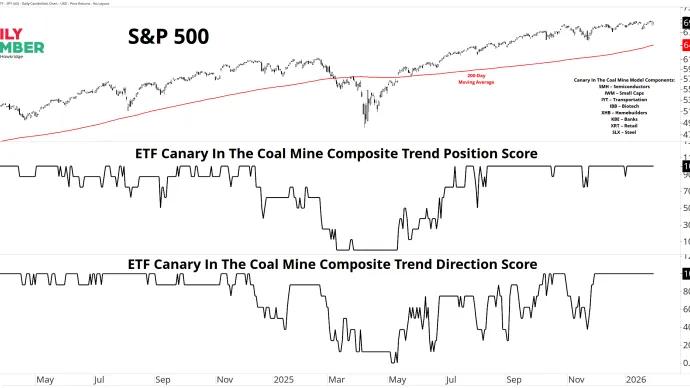
Grant Hawkridge Every Canary Is Still Breathing 🐦 Today's number is... 100%The ETF Canary In The Coal Mine Composite Trend Position Score is 100%, and the Trend Direction Score is also 100%.Here’s the chart: Let's break down... February 2, 2026 The Daily Number Grant
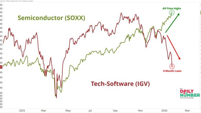
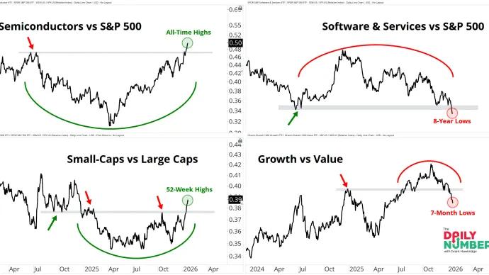
Grant Hawkridge Tech Is Not One Trade 🤖 Today's number is... 21%Software is down 21% from its highs, while semiconductors sit at all-time highs.Here’s the chart: Let's break down what the chart shows:The chart displays... January 30, 2026 The Daily Number Grant
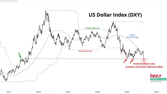
Grant Hawkridge The Dollar Is Breaking Down 💵 Today's number is... 96.0The US Dollar Index just hit fresh 52-week lows at 96.0, the lowest level since February 2022.Here’s the chart: Let's break down what the chart shows:The... January 29, 2026 The Daily Number Grant
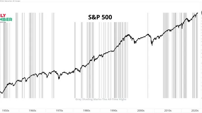
Grant Hawkridge Price Is Acting Like a Bull Market 📈 Today's number is... 4Yesterday, the S&P 500 logged its 4th all-time high of 2026.Here’s the chart: Let's break down what the chart shows:The chart displays the S&P 500 as... January 28, 2026 The Daily Number Grant
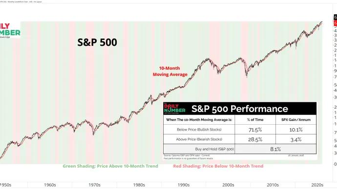
Grant Hawkridge Nothing Fancy. Just Follow the Trend. 📏 Today's number is... 71.5%The S&P 500 has traded above its 10-month moving average 71.5% of the time since 1950.Here’s the chart: Let's break down what the chart shows:The... January 27, 2026 The Daily Number Grant
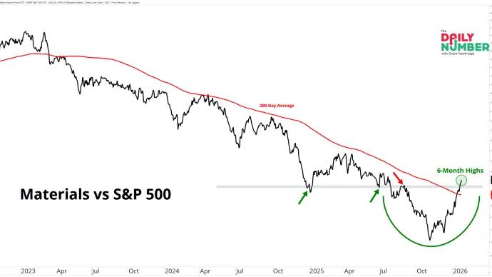
Grant Hawkridge Materials Are Back in Play 🧱 Today's number is... 6Materials vs the S&P 500 just hit a 6-month high after a long stretch of relative weakness.Here’s the chart: Let's break down what the chart shows:The... January 26, 2026 The Daily Number Grant
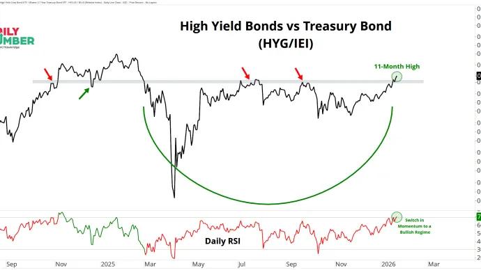
Grant Hawkridge This Is Not a Defensive Market 💥 Today's number is... 11High Yield Bonds versus Treasuries just pushed to an 11-month high.Here’s the chart: Let's break down what the chart shows:The chart displays a ... January 23, 2026 The Daily Number Grant
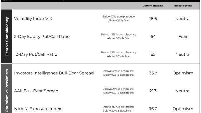
Grant Hawkridge How Market Sentiment Looks Right Now 👀 Today's number is... 6Six key sentiment and positioning reads I track each week to gauge crowd pressure.Here’s the table: Let's break down what the table shows:The table displays... January 22, 2026 The Daily Number Grant
Grant Hawkridge Rotation Looks Defensive. It Isn’t 📉➡️📈 Today's number is... 4Four different relative relationships are moving in different directions at the same time.Here’s the chart: Let's break down what the chart shows:The top-... January 20, 2026 The Daily Number Grant
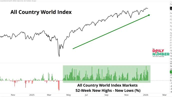
Grant Hawkridge Global Breadth Will Not Let Go🌍 Today's number is... 88.8%Global markets have posted more 52-week highs than 52-week lows on 166 of the past 187 trading days since April 22, 2025.Here’s the chart: Let's break down what the chart shows:... January 20, 2026 The Daily Number Grant
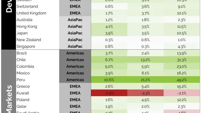
Grant Hawkridge Global Markets Are Trending Higher🌍 Today's number is... 100%100% of developed markets are trading above both their 50-day and 200-day moving averages.Here’s the table: Let's break down what the table shows:The... January 15, 2026 The Daily Number Grant
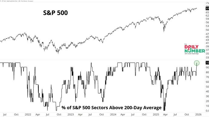
Grant Hawkridge Breadth Is Not Guessing. It Is Fully On.🔥 Today's number is... 100%The percentage of S&P 500 sectors trading above their 200-day moving average just pushed back to 100%, the highest level since November 2024.Here’s the chart: Let... January 15, 2026 The Daily Number Grant
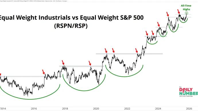
Grant Hawkridge Industrials keep climbing the stairs 🪜 Today's number is... 0.30Equal-weight Industrials just pushed to a new relative high versus the equal-weight S&P 500.Here’s the chart: Let's break down what the chart shows:The chart shows a... January 14, 2026 The Daily Number Grant
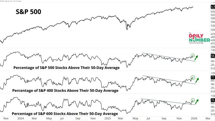
Grant Hawkridge This Is What Broad Trend Strength Looks Like 📈 Today's number is... 70Roughly 70% of stocks across large, mid, and small caps are now above their 50-day moving averages.Here’s the chart: Let's break down what the chart shows:... January 13, 2026 The Daily Number Grant
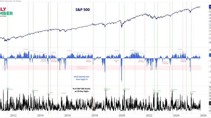
Grant Hawkridge Breadth Is Not Fading. It’s Expanding🔥 Today's number is... 11.4%NYSE Weekly Net New Highs just reached 11.4%, the highest reading since 2024.Here’s the chart: Let's break down what the chart shows:The top panel... January 12, 2026 The Daily Number Grant
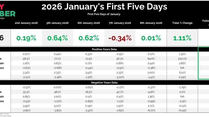
Grant Hawkridge January Cleared Its First Test ✅ Today's number is... 5The first five trading days of January are complete, and the S&P 500 finished the window up 1.1%.Here’s the table: Let's break down what the table... January 9, 2026 The Daily Number Grant
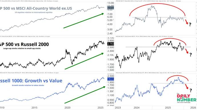
Grant Hawkridge Three Key Market Themes Under Pressure 🔎 Today's number is... 3Three key leadership ratios are trading below their most important levels right now.Here’s the chart: Let's break down what the chart shows:The chart... January 7, 2026 The Daily Number Grant
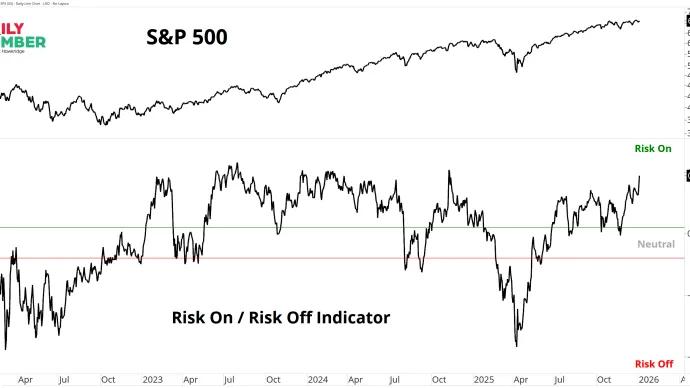
Grant Hawkridge Risk Appetite Is Pressing to New Highs 🔥 Today's number is... 0.9My Risk-On Risk-Off Indicator stands at 0.9, its highest level since early November 2024.Here’s the chart: Let's break down what the chart shows:The chart... January 6, 2026 The Daily Number Grant