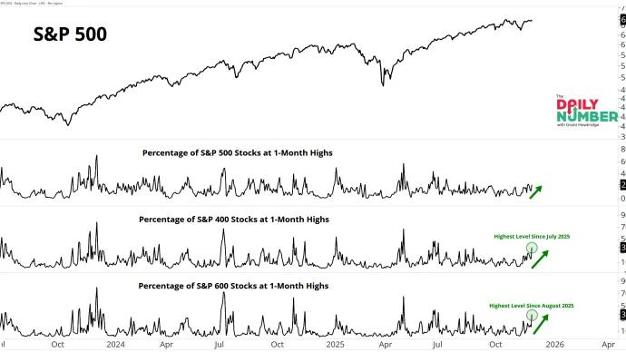
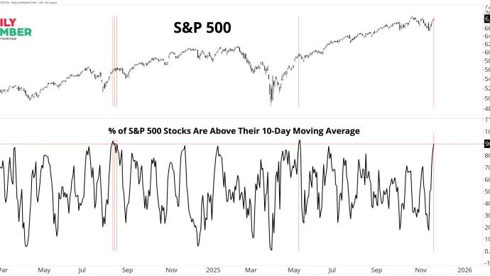
Short-term participation exploded on Friday, with 90.1% of S&P 500 stocks finishing above their 10-day moving average, our first 10-day breadth thrust since May.
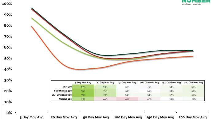
The 5-day moving average window just lit up across the market. Every major index now sits near the top of its short-term breadth curve after a sharp reset.
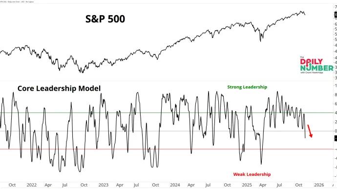
My Core Leadership Model, the composite that blends short, intermediate, and long-term breadth, has slipped back under zero and is moving toward the weak leadership zone.
When I started this note, I had one goal. Share one piece of market truth each day. No noise. No drama. Just data. Something useful traders could read in under two minutes and walk away sharper.